Lyft-Baywheels Chrome Extension
Time: 2021
Role: Developer
Tools: Javascript, shadow DOM, chart.js, CSS, Pivot Tables
Problem statement:
As a resident in SF without a personal vehicle, my friend started using Baywheels ride share bikes and eventually decided to subscribe, believing it’d be worth it in the long run. I wanted to make a tool to analyze whether a subscription is actually worthwhile based on the user’s ride history pattern.
Analysis:
Consumer’s Average Bike Data was calculated with Lyft’s public data in 2021 (Note: Lyft only started segregating by bike type in April 2020)

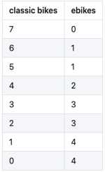
Based on the consumer’s average bike data, with membership at $13.25/month or $159 yearly, the minimum # of rides per month should be at least:
- 7 classic bikes a month
- 4 ebikes averaging 12-13 minutes
-
Some combination of the two
 .
.
Using this information and the user’s ride history, the extension produces a summary of a user’s ride history habits, such as number of bikes riden and frequency.
More details can be found in the Github repo.
Demo:
Navigate to Ride History.
By default, the extension popup will appear. User can close the popup and summon as needed by clicking on the extension again.
Choose a date range. Only required to pick a start date.
Earliest start date is restricted to the first bike ride in the user’s history.
The latest end date that can be selected is restricted to either the current date (user’s local time) or a year after the selected start date, whichever occurs first.
By default, the data displayed is the selected date range. There is a checkbox that the user can use to toggle between the selected date range and the user’s entire ride history date range. The toggle updates the data for the Summary and Visualization tabs.

Improvements / TBD:
Extension is functional and does what I intended it to do, but there are potential improvements to the experience and design, such as:
- currently there are chrome extension error messages (app is still functional)
- bug: selecting end date does not include the date ie. selecting 02/14/2021 does not include 02/14/2021 data in analysis
- bug: add feedback to UI when user does not select a start date
- tooltip not working in charts
- show values on charts
- calculate total saved if membership recommended
- test on more comprehensive ride history (only tested on my personal ride history, but I don’t live in SF)
- personalize the membership recommendation (since calculations were based on average consumer data rather than individual personal data for time-saving purposes)